Design Minimalist Websites
Key Takeaways
- Minimal design should remove friction, not useful information.
- Clear hierarchy, direct navigation, and visible actions help users move quickly.
- Fast, accessible pages are easier to use on every screen size.
- White space should support reading and decisions, not create emptiness.
- A simple site can still have a distinct voice, proof, and warmth.
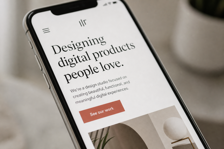
Minimal web design is not about stripping a page down to the bare minimum. It is about making the useful parts easier to notice, understand, and use. Browsing minimalist ui examples can be helpful for visual inspiration, but the best results come from deciding what a visitor needs to do before choosing colors, typefaces, or effects.
A clean website should feel calm without feeling cold, and simple without leaving people uncertain. When structure, copy, accessibility, and performance work together, minimal design becomes a form of good service. It reduces friction while still giving visitors the detail, reassurance, and personality they need to act with confidence.
Why Clean Design Still Matters
Most visitors scan before they read. They look for a page title, a clear benefit, proof that the business is credible, and the next sensible action. A crowded interface asks people to sort through competing messages. A focused layout reduces that mental effort and works especially well on smaller mobile screens, where every extra element consumes valuable space.
That does not mean every page should be sparse. A simple website has a deliberate structure and enough context to answer questions. An unfinished website has missing explanations, hidden contact options, vague calls to action, and empty space where useful content should be. The goal is clarity, not austerity.
Start With the User’s Main Task
Every important page needs one primary task. A service page may guide someone to book a consultation. An ecommerce category page may help them compare products. A blog post may encourage readers to understand a topic and explore a related solution. A contact page should make it effortless to find the right way to reach the business.
- Identify the most important action a visitor should take.
- Place that action near the content that explains its value.
- Remove banners, pop-ups, and secondary choices that compete with it.
- Ask a first-time visitor to complete the task without instructions.
Build a Strong Visual Hierarchy
Hierarchy tells visitors what matters first, second, and third. Use one clear page heading, descriptive subheadings, short paragraphs, and meaningful grouping. Keep related details close together, such as a product price, delivery information, and purchase button. Use spacing to separate ideas, not simply to fill the screen.
Make interactive elements obvious
Buttons should look and behave like buttons. Links should be visually distinct and describe where they lead. Limit competing colors and type styles so the primary action has room to stand out. If every section uses a large headline, bright accent color, and animation, nothing feels important.
Keep Navigation Simple, Not Hidden
Minimal navigation should use familiar labels such as Services, Pricing, About, Contact, or Shop when those labels match the visitor’s expectations. Key pages should be easy to reach without guessing. Avoid relying on unexplained icons or placing important information behind menus that are difficult to find on mobile.
For larger sites, clear page titles, logical categories, and breadcrumbs can help visitors understand where they are. Test the navigation with a keyboard as well as a mouse or touch screen. Visual restraint should never make basic information harder to access.
Use Content to Add Personality
Clean layouts do not require bland copy. Strong wording gives a quiet design character. Replace broad claims like “industry-leading solutions” with specific statements about who the business helps, what it does, and why its approach matters. A short customer story, a useful answer to a common question, or a precise process description can create trust without adding clutter.
Write headlines that say something real. Keep the tone warm, but do not add filler just to sound friendly. Readers should leave with a clear sense of the brand’s point of view and the practical value it offers.
Make Performance Part of the Design
Speed is a design decision. Large images, unused plugins, autoplay video, and decorative scripts can turn an elegant layout into a frustrating experience. A minimal UX philosophy supports faster decision-making by removing unnecessary steps and distractions, rather than merely reducing visual decoration.
- Compress images before uploading and use modern formats where available.
- Load essential copy, navigation, and calls to action before decorative media.
- Remove scripts, plugins, and effects that do not help visitors complete a task.
- Test pages on an average mobile connection, not only fast office Wi-Fi.
Design for Accessibility From the Start
Accessibility should shape the first draft, not become a final checklist. Use readable text sizes, high contrast, visible keyboard focus states, logical heading levels, and clear form labels. Give meaningful images with useful alternative text, and do not rely on color alone to communicate an error, status, or required field.
The 2026 WebAIM accessibility report found detectable WCAG failures on 95.9% of the one million home pages it tested. Low-contrast text was the most common issue, which is a useful reminder that a pale, fashionable interface can quickly become difficult to read.
Balance White Space With Useful Detail
White space can guide attention, improve readability, and make a page feel less demanding. It should not force visitors to scroll through oversized gaps before reaching basic details. Keep related information together and retain the context people need to make a decision, including prices, specifications, timelines, FAQs, testimonials, contact details, or return policies when relevant.
Add Motion With Care
Animation works best when it explains a change or confirms an action. For example, a button can show a submitted state after a form is sent. A large moving background that delays reading usually adds little value. Keep transitions brief, avoid motion that blocks content, and respect reduced-motion preferences.
Test a Minimal Website Before Launch
- Ask a first-time visitor what the page is about after a few seconds.
- Ask them to complete the main task and note where they hesitate.
- Check the design on phones, tablets, and desktop screens.
- Review keyboard navigation, contrast, forms, headings, and image descriptions.
- Test loading speed, then rewrite unclear labels and remove distractions.
Common Mistakes to Avoid
- Using tiny text or light gray copy to preserve a sparse look.
- Replacing useful explanations with vague slogans.
- Hiding navigation behind unclear icons.
- Removing trust signals, proof, or contact information.
- Using oversized media and motion that slows the page down.
A Simple Pre-Publish Checklist
- Can visitors quickly understand the page’s purpose?
- Is the main action easy to find and understand?
- Does each section earn its place?
- Can people navigate and use forms without a mouse?
- Does the page remain useful on a slower mobile connection?
- Does the site feel distinctive without becoming cluttered?
Conclusion
Minimal web design works when it gives people less to fight through, not less to learn. The strongest websites pair clean layouts with useful content, visible navigation, accessible choices, and fast performance. When every element has a purpose, simplicity feels human, helpful, and easy to trust.
About the Author